top of page

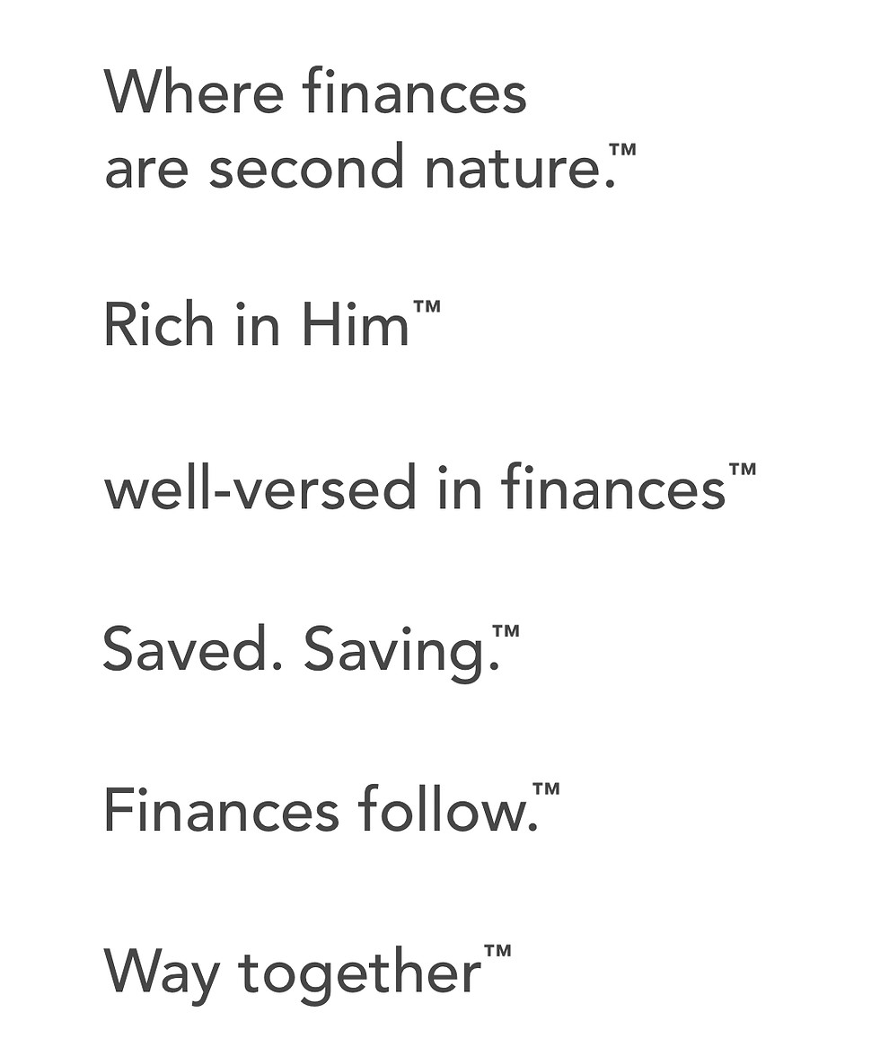
Aligned to strategy.
Abounding in creativity.
Always.

WH Law: rebrand, campaign, website

Our relationship started with a simple honest statement during a phone call—I don’t really have a strategy or know how to talk about us. This was the jump off point for a deeper look at the law firm. They always had a rebellious streak. But how could that be balanced with other elements of who they are? And more importantly, how are we to talk about WH? 

What we created was a multi-faceted brand focused on simplifying the law for people, humanizing lawyers, embracing uniqueness, and above all, building trust with the potential client. WH has experienced huge success from this work. A unique statistic to highlight—they went from 80 applicants a month to 349 in a day. They found success not only in clients, but developing an internal culture that attracted strong talent.

My work spanned client discovery and interviews, persona development, mission/vision, campaign ideation, visual direction, wireframing, website copywriting, project coordinating, on-site video directing, finding stories from open-ended interviews, social media strategy, social campaign, print ad work, and more. I worked with some incredible designers, videographers, web developers, in-house marketing, and the WH Law leadership to deliver exactly what was promised and more. It was a beast and a joy.

Wait No More: verbal architecture, taxonomy, website

Wait No More is the adoption and foster care arm of a large nonprofit and faced an identity crisis. The project was largely launched for a new website, but what we found was a greater need. Who were they in the scope of the bigger entity? The sensitive nature of their audience was a far cry from the traditional core, so how could they honor the greater audience, while not watering down their message?

The way their resources and services were framed bunched everyone together, meaning foster parents in the middle of crisis and general donors or interested parties came to the same page. The former language failed to be both inclusive and real. It was too heavy for some, and too watered down for others. I helped visualize a structure that allowed for different tracks of content, while building out an umbrella that appeals to wider audiences. And from there, partnered with the web dev agency to wireframe and write a website that hits the mark.

The team felt more than happy with the result—they found a new identity and vigor for their marketing. I was truly humbled to work with such a worthy cause. If you (reader) happen to know anything about foster care, it’s one of the most needed and noble acts of service.

BlueThread Services: naming, tagline, website

A private equity group out of San Diego was in the process of purchasing multiple roofing companies across the west. They wanted a name that stood out in the industry and hinted at the connection of portfolio. Plus, a tagline and core values that aligned the greater culture and attracted future roofing companies. The first step, like the above, was to actively listen to the greater CEO and current CEO’s of the family of roofing companies. 

What I found was more than just practice safety, it was a call to camaraderie and a deep desire from the lower CEOs to share best practices and insights. They were hungry for knowledge and to increase revenues in a sustainable way. Once the basics were covered, I worked with a marketing agency to make the website and visuals match the foundation. 

This project included discovery, brand naming, tagline, wireframing, visual direction, and more.

US Electrical & Communications: tagline/big idea, copywriting

I partnered with a local agency who desired key messaging to help the client. Most importantly, a “big idea” that could create a theme for marketing and internal rally cry. Something that represents the ethos of the company in a short, punchy, eye-catching way. My first step was to interview key team members to understand their perspective on the company and find connections.

Where we landed was exactly what they hoped to see. The tagline is a jump-off point for multiple stories and easily creates differentiation in a market driven by cliche language (integrity, trust, hard work, etc.) Even more, it is a benchmark for their internal culture.

IMG_2062.jpeg

Want to know about me?

The above examples are just the tip of the iceberg. I’d love to hop on a call and tell you more about each of the projects. If it’s creativity, it’s exciting. But enough of the work, I’m sure you’d like to learn a little about the guy who did the work! Check out my about page.

© 2024 by Grayword LLC. All rights reserved.

Clearly communicating the purpose-driven brand. Colorado Springs based, without borders. 

Enjoy some random stuff.

bottom of page